2014 -- 2019
Skycure Admin
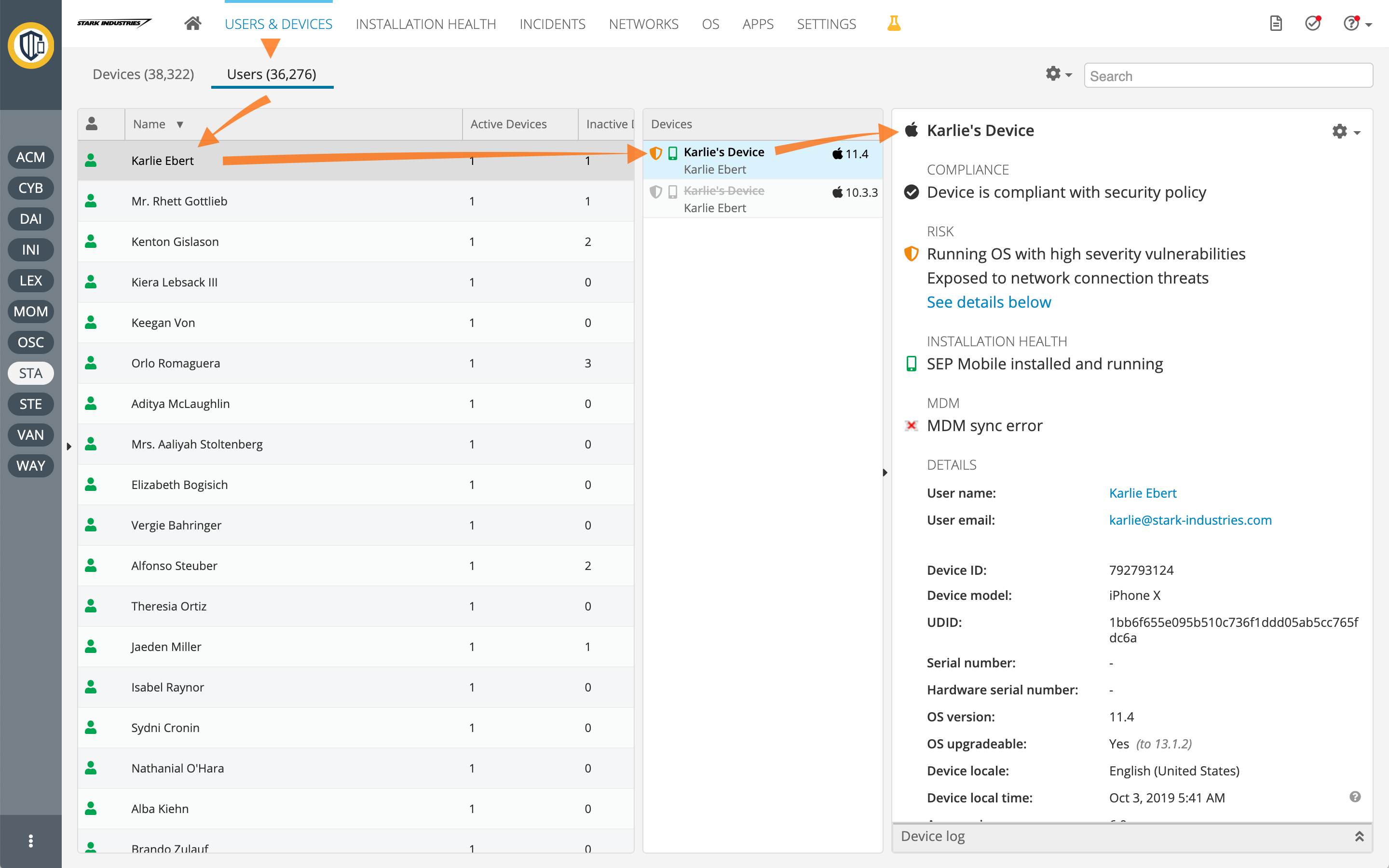
Mobile Security Management Console
Interaction / Visual / Product Design, Information Architecture, Usability, Prototyping, UX Research, UI Toolkit Consulting (HTML/CSS/JS), Accessibility, i18n
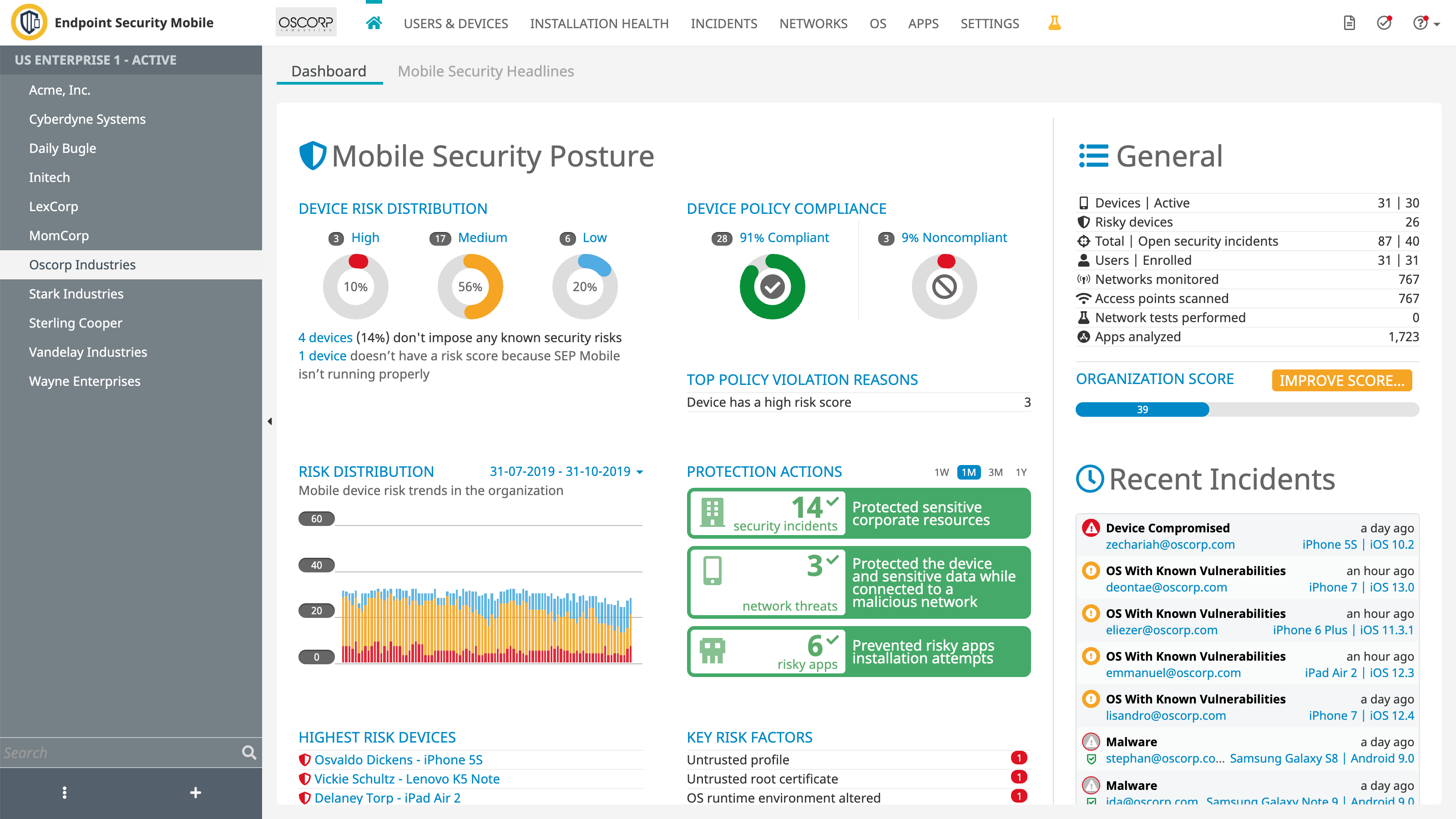
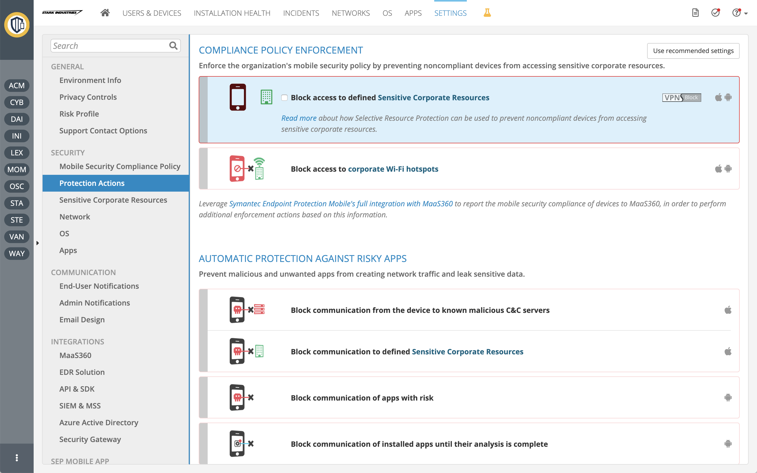
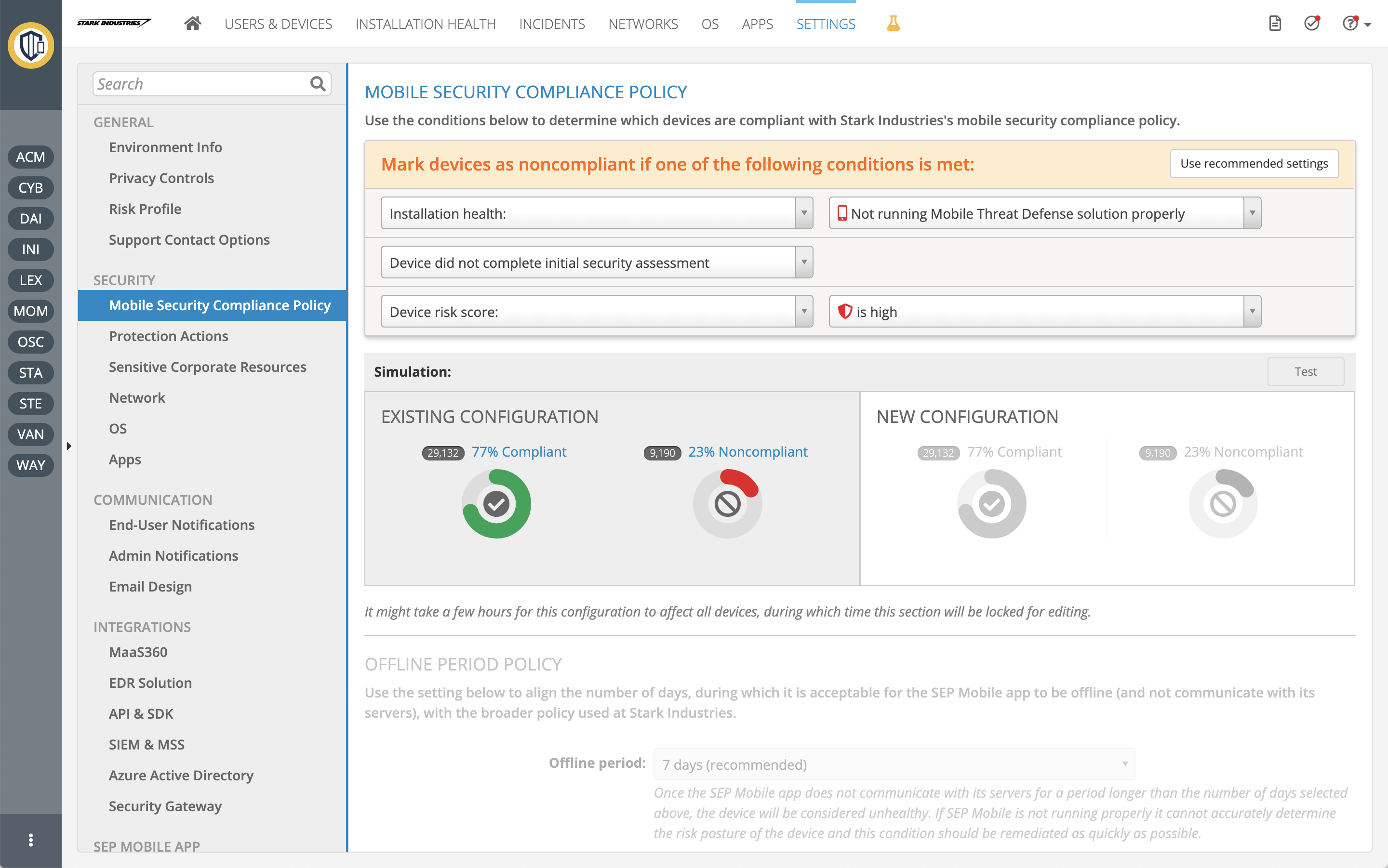
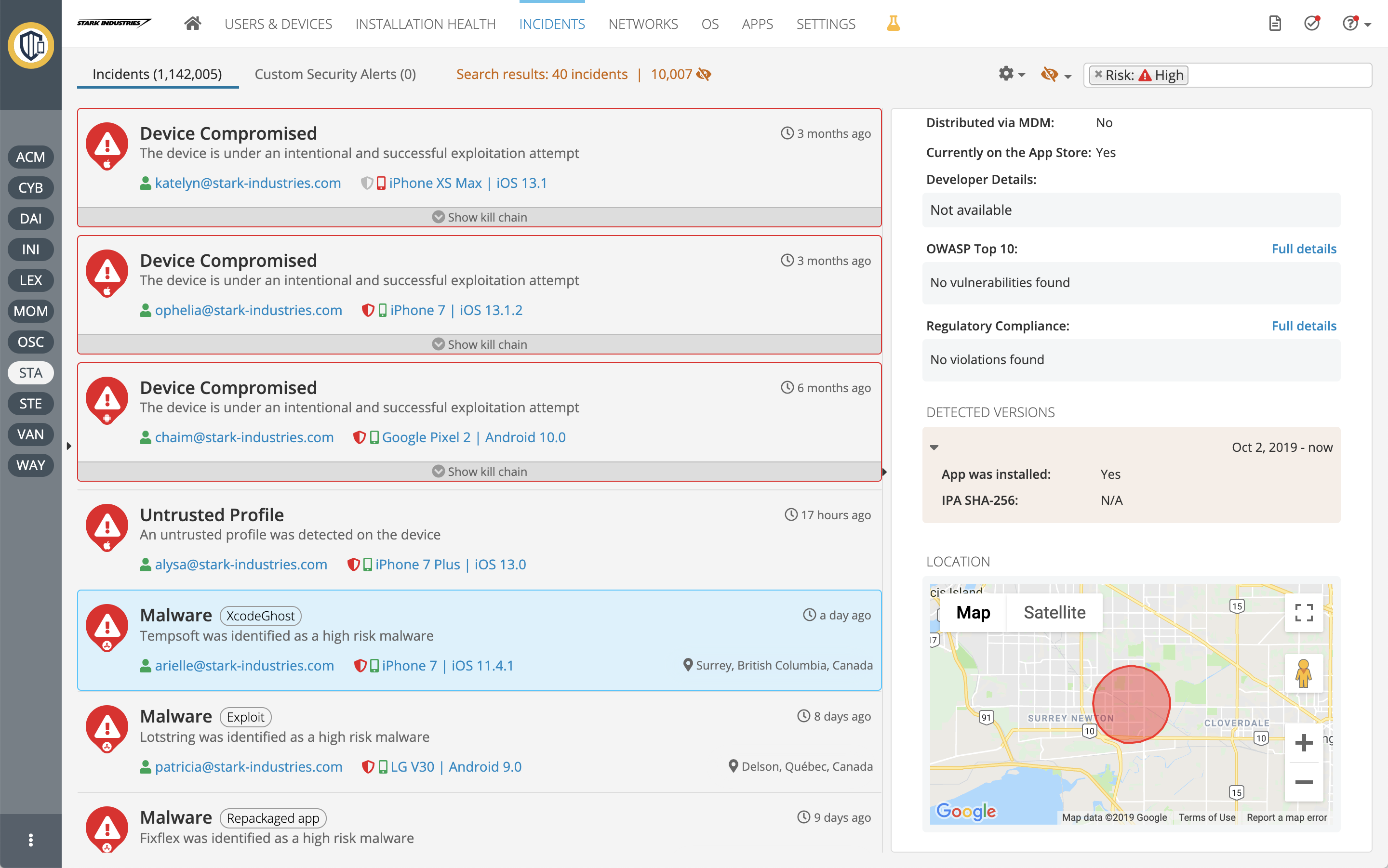
Skycure (acquired by Symantec) management console is used to reveal and visualize the security posture of mobile devices in the organization and manage compliance policies, protections, integrations, and a plethora of settings. Selling to organizations, this part of the solution, which is targeted to the security administrators, was the main development effort.
Background
I joined Skycure in its early stages to lead the startup's UX efforts. As the company basically invented mobile security products, we had to innovate, create, and discover as we went.
Role
I worked on this project for 5 years, evolving countless ideas, concepts, and features into reality. I was the only UXer on the team. My partners were the Products Lead and team (as it evolved), and of course, the engineers with whom I worked very closely.
Research
Interviews
In the early stages of a B2B startup, there are not many users to research. Interviews are the primary research method. I attended every meeting I could with users and customers, in many cases just to listen in. Salespeople, customer success people, and managers who meet customers were also valuable sources of information, although indirectly.
"Stealth Usability Testing"
A method I used a lot is observing users interacting with the product. In most cases, the setup is a remote meeting with users. All I had to do was participate and request that the user "drive". It reveals everything that a usability test reveals, and in a more natural environment. While not targeted always, this method is easy and cheap and can occur regularly, thus covering much of the product. With time, a good picture of the product's usability (and pitfalls) is painted.
Analytics
Like most SaaS products, we plugged analytics services into our code. These sometimes revealed surprising findings like unused areas of the product or other valuable statistics that could inform the design (a significant percentage of IE users, screen size, etc.)
Sketches and wireframes
When it comes to major changes and additions, I usually start the design process with low-fidelity wireframes. They serve primarily for my design process -- to iterate through many options quickly. When some design ideas are more set, prototypes also serve to gather initial feedback from product managers, developers, and stakeholders.
Management Console
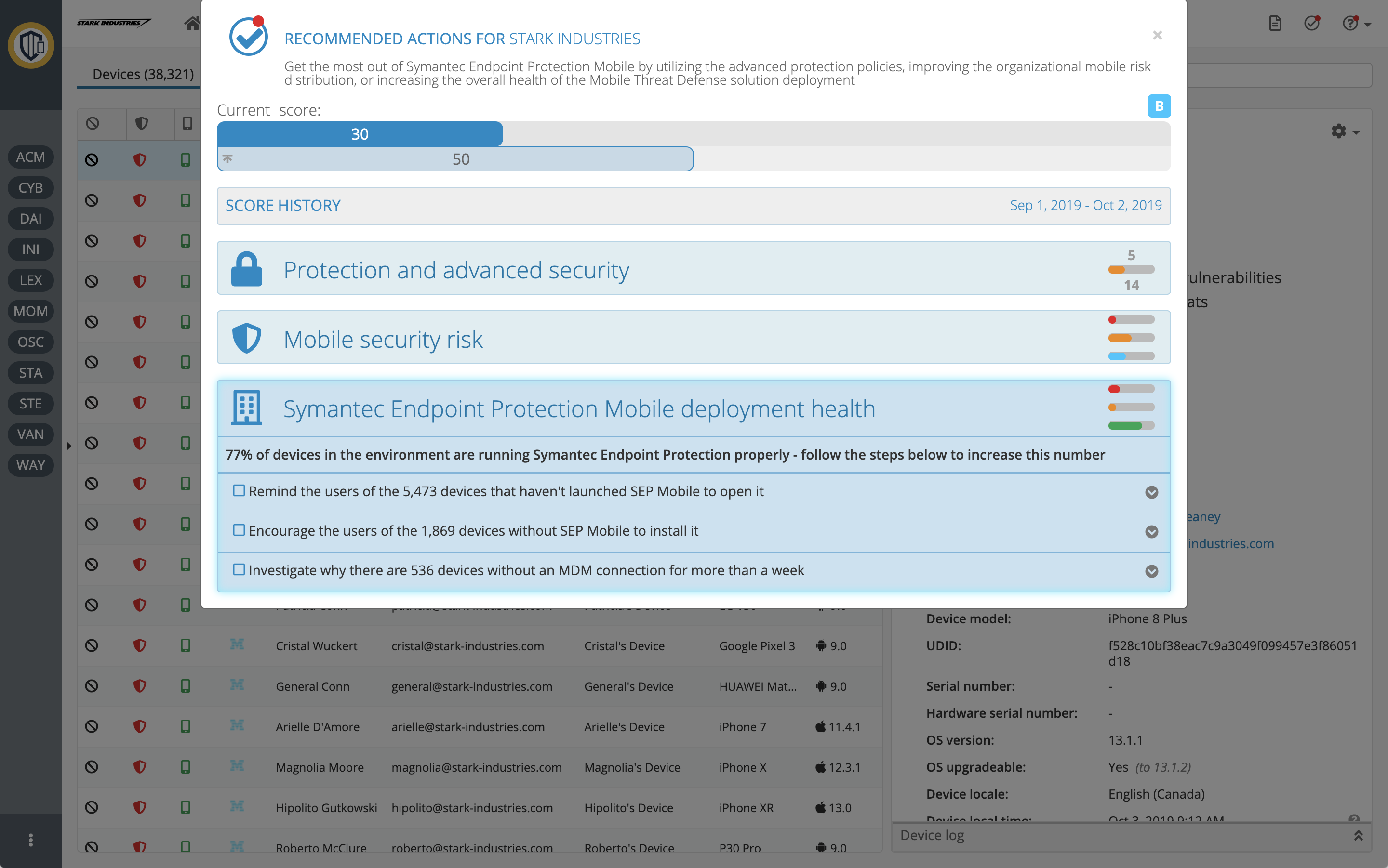
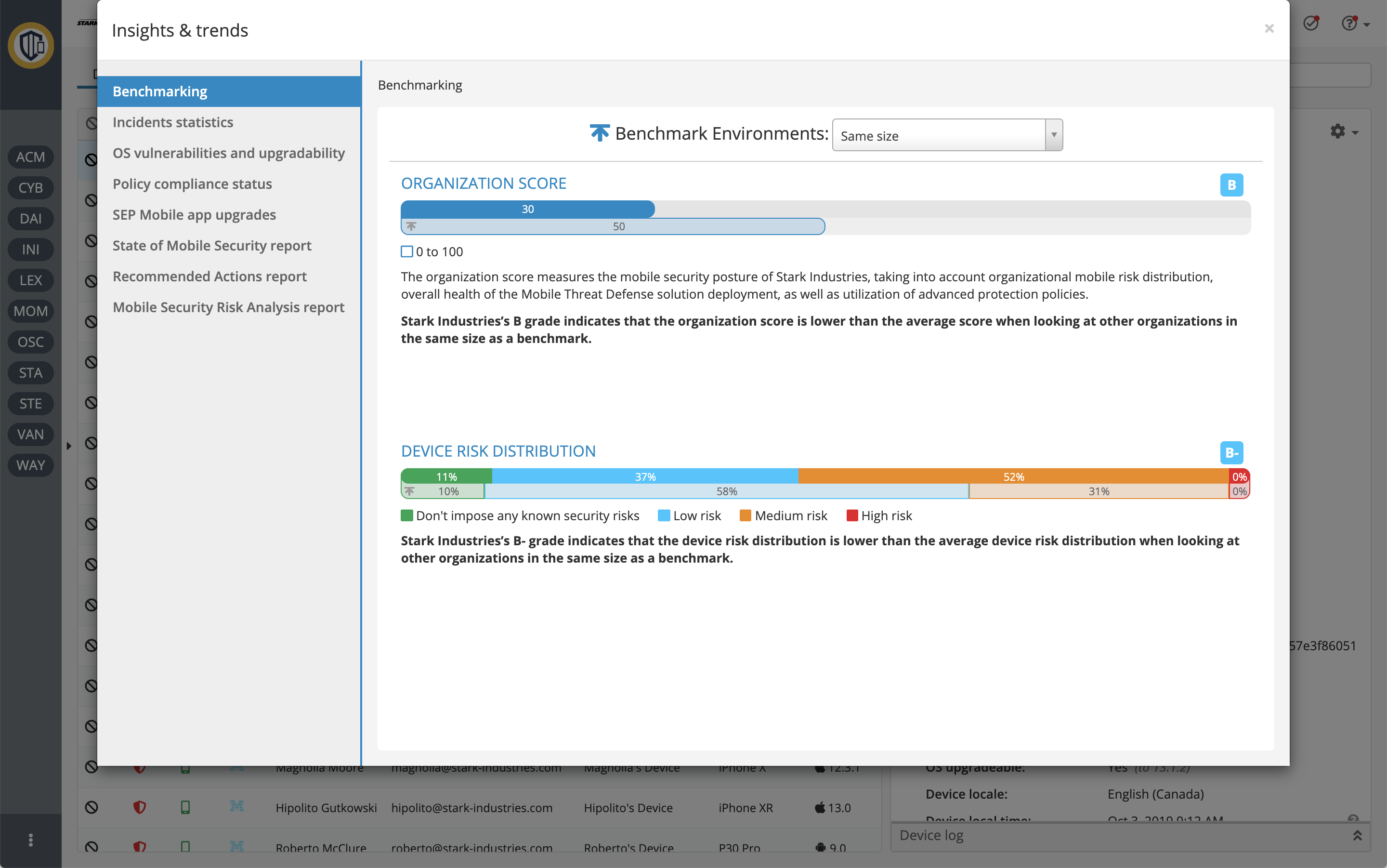
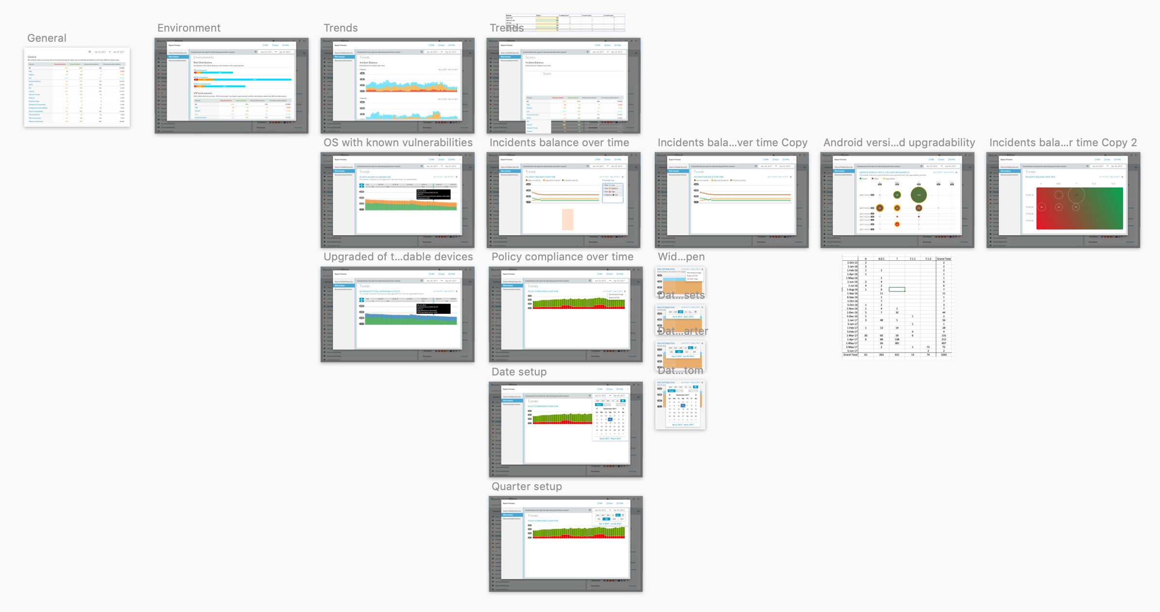
The dashboard serves as the overview of the organizations' mobile fleet security.
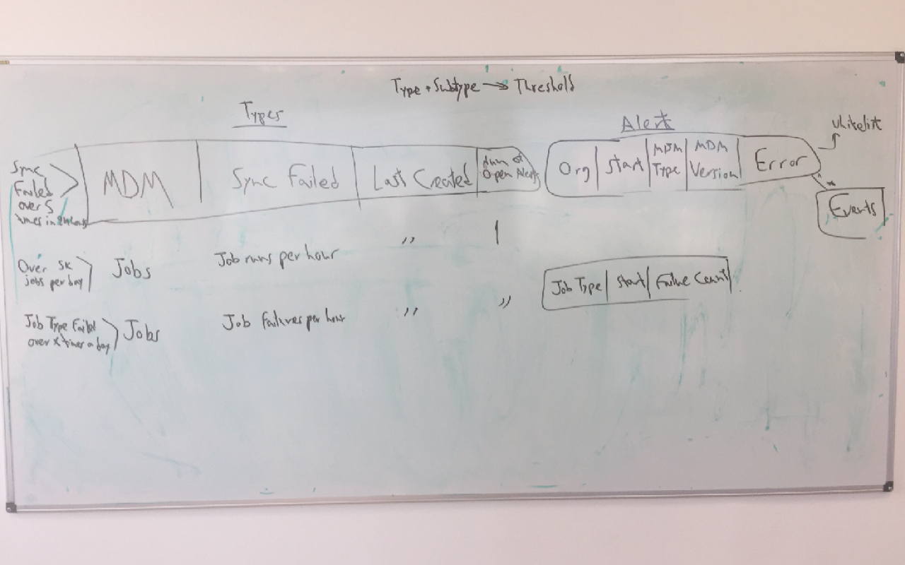
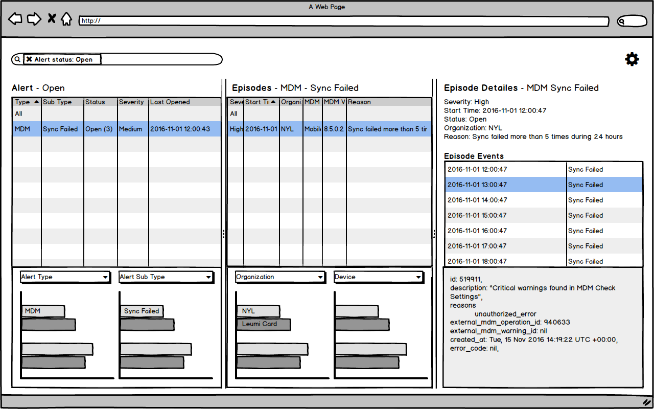
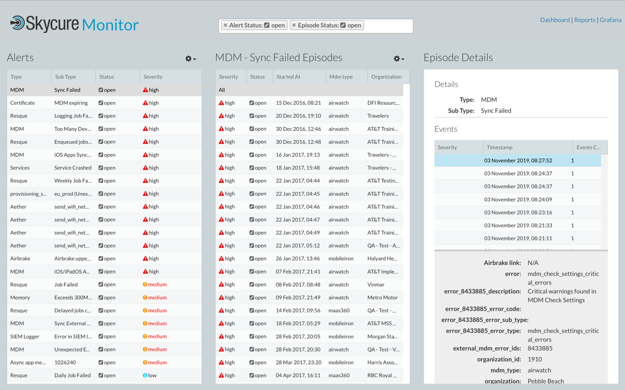
"Incidents" is where administrators can see and evaluate security breaches in the mobile device fleet.
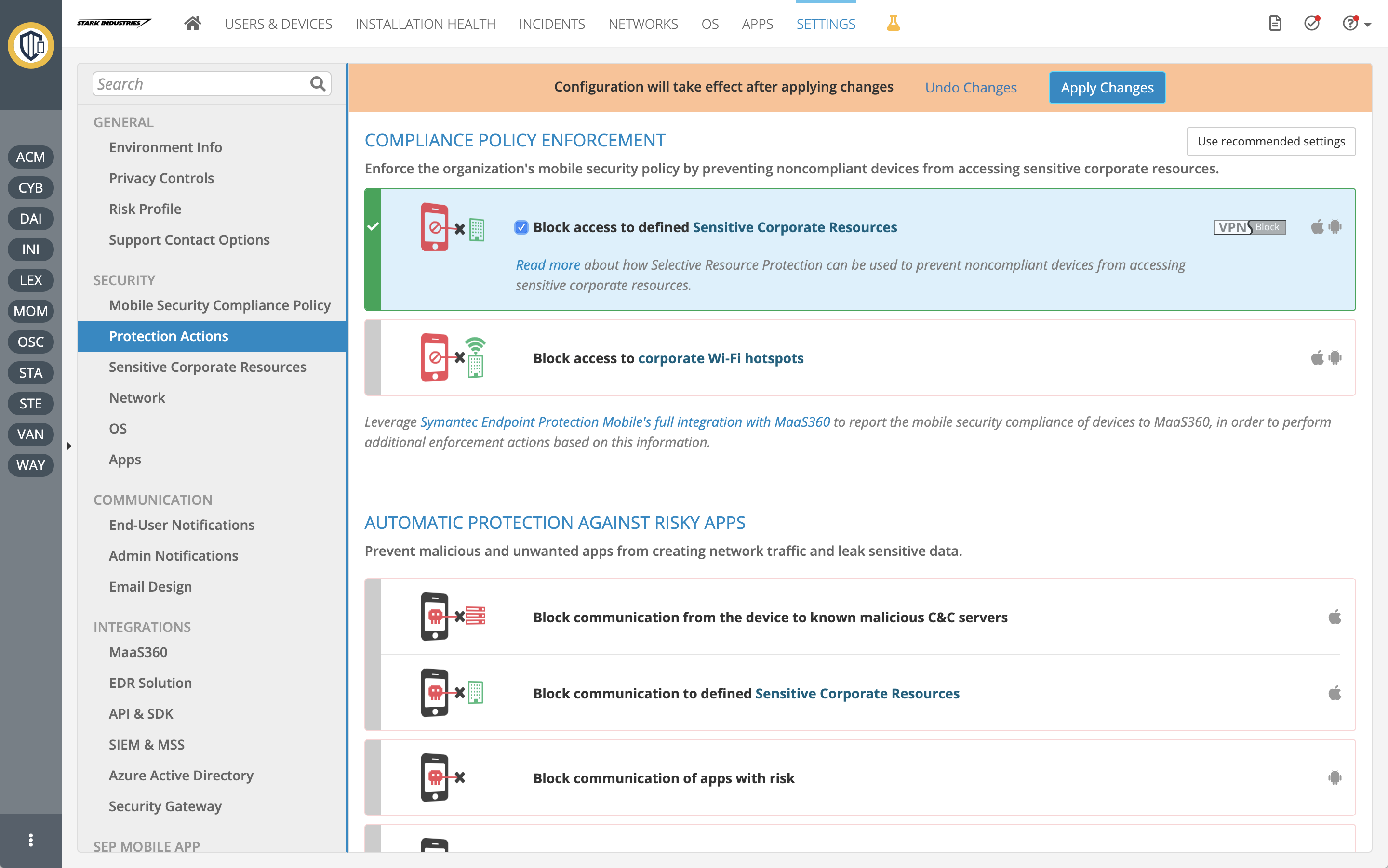
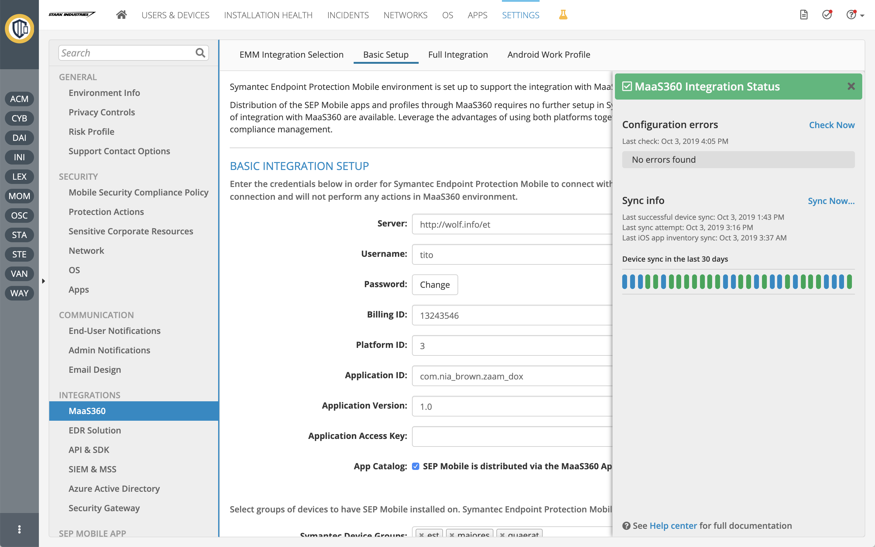
While the application is shipped with good defaults, it is rich with customizations, integrations, and policy management options.
Prototypes
Wireframe, mockup, walkthrough... I call it a prototype. My definition of a prototype: any deliverable representation of the product. It may be a very crude whiteboard or paper sketch, a polished image, or a fancy walkthrough. Most of the prototyping is for myself, for my design process.
When presented, the fidelity level is selected based on the audience. Even when it is polished, I see it as a model, sometimes an early sample. As a concept, unlike "mockups" that describe how things should exactly look, I prefer to leave room for ideas, suggestions, and changes. Working with the smartest and most knowledgeable people in their domain taught me that their view is super beneficial to the result.
My Sketch pages usually are filled with options of the same design and then variants of that design. Early on, I check that it works consistently in all cases.
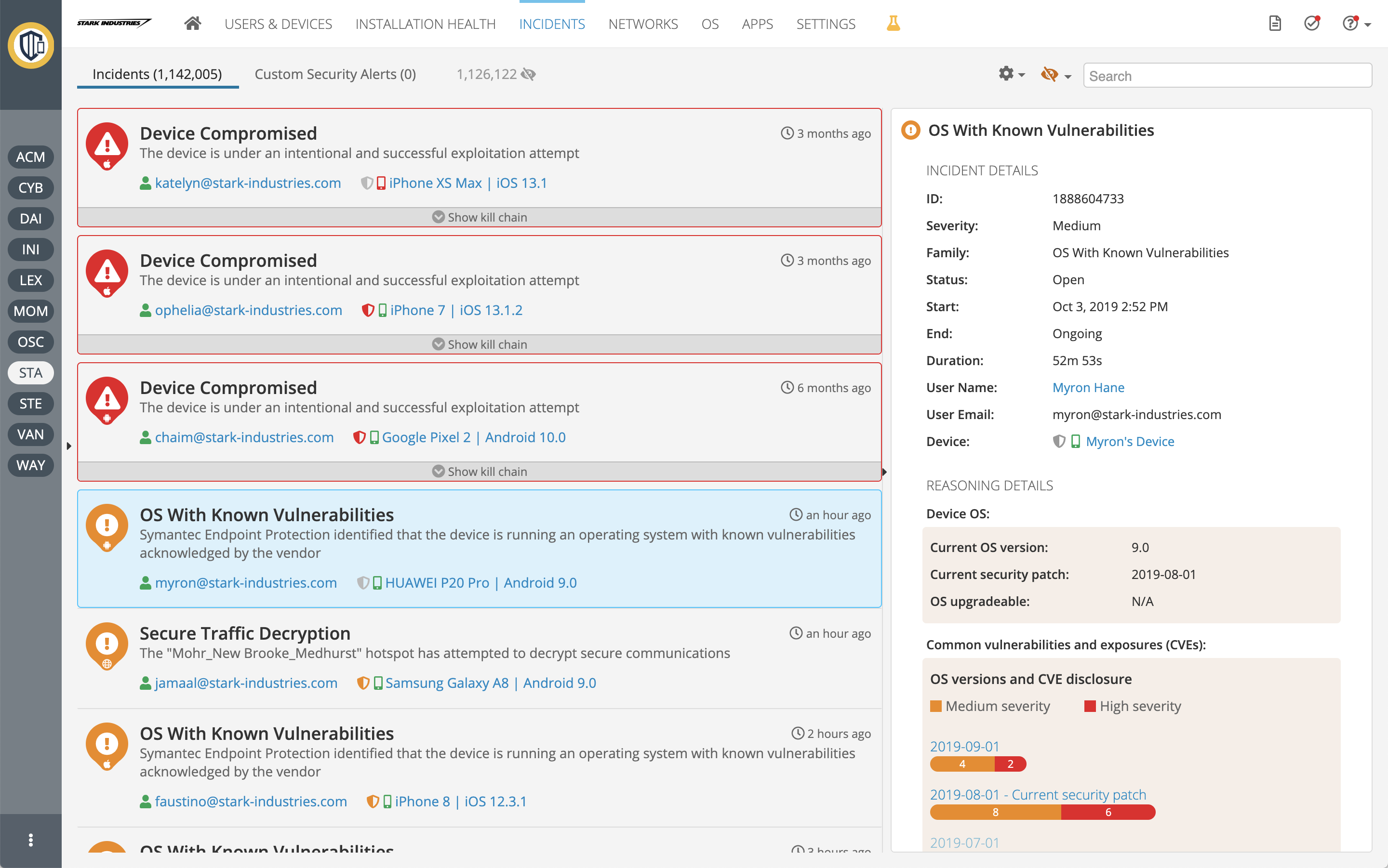
Security incidents view
Design
We had the opportunity to design a security management system for a new domain, from scratch. While we could not ignore industry standards in adjacent fields, we weren't bound to existing, sometimes archaic, conventions in the other security areas. Our basic promise was "you do not have to be a security expert to understand and successfully use our system".
Visual Design
The design is clean, yet warm and balanced between whitespaces and content. Building a rich application, targeted to corporates and specific customers, we learned that we had to be efficient with real-estate -- "airy" website style was not an option. Bold tints were used for risk, mid blues for navigation and highlighting, and additional accent colors for visualizations.
Interaction Design
Looking at analytics and conducting interviews, we knew admins in our system are rarely experts. In common usage, they may visit for several minutes daily or occasionally. The layout is, therefore, designed to be orientation-centric. Like in any system, the details are always essential; however, here, the overview, navigation, and wayfinding became vital as well. The design shows more of how elements are related and places a higher emphasis on interaction consistency.
A price may be on more crowded screens. One solution we offered in consideration was the ability to keep less-used panes either expanded or collapsed, while still allowing interaction with them when hovering.
Toolkits
We built on and customized standard toolkits for layouts, UI components, icons, and data grids, while developing our own toolkit for charts, visualizations, forms, and views. Being fairly technical myself, I developed the toolkit and its samples -- CSS, HTML, JavaScript -- and helped with client-side architecture and third-party toolkit selections.
Skycure Mobile App
Now SEP Mobile
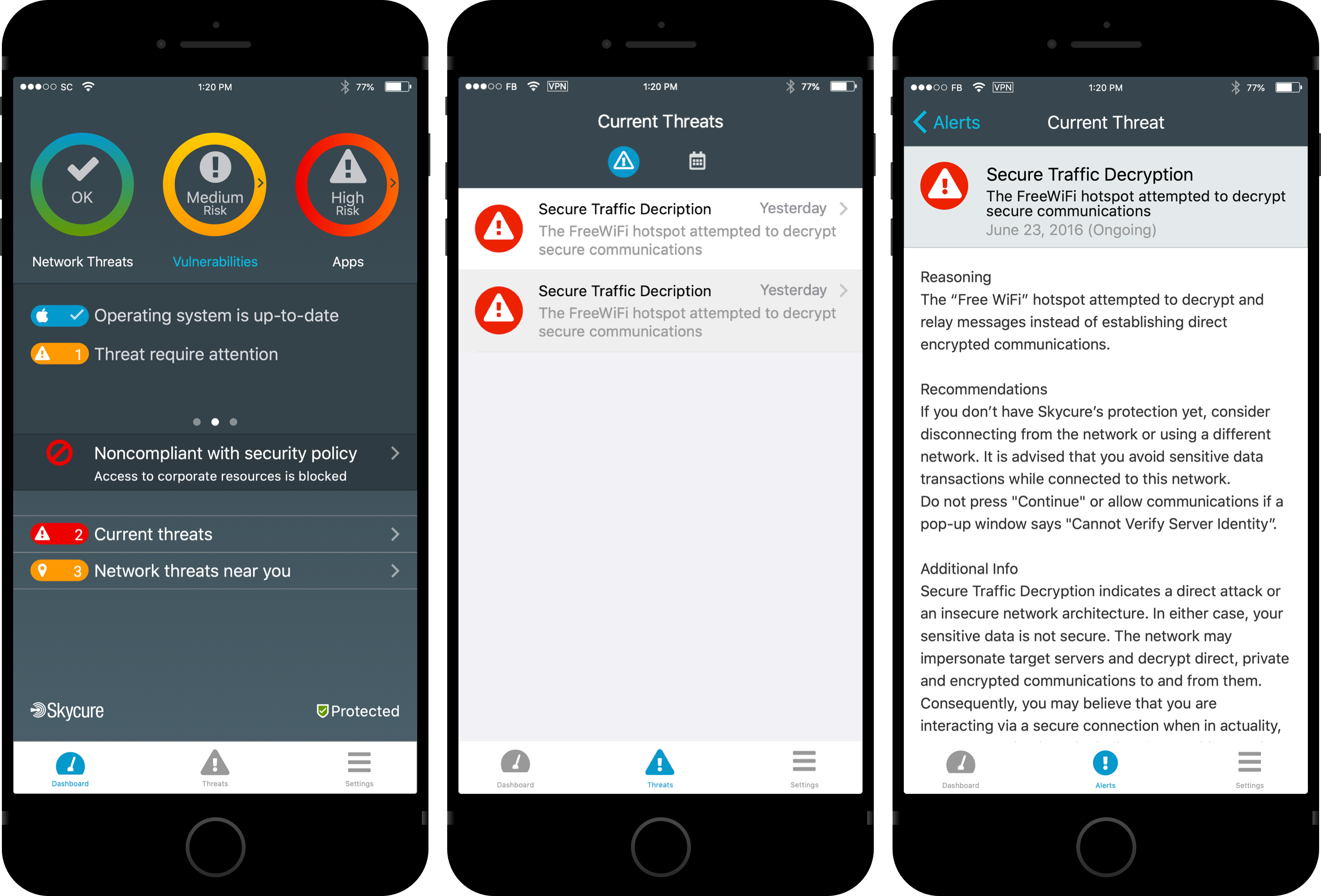
Skycure must be installed on end users' mobile devices to protect them, monitor security vulnerabilities, and report issues to the organization. It is the device's sensor.
The app wasn't meant to be of daily usage, but millions of users installed it as a policy from their organization or to feel safer when using apps or connecting to Wi-Fi networks. We divided the app into two main parts: a dashboard where bright indications advertise the device's security posture by categories, and a list of findings, including educational information.
We were amazed again and again by end-user acceptance and how an enforced policy, in many cases, turned into real engagement.
"Everyone knows Symantec's UX sucks, except SEP Mobile [this product]. I think we need to learn from you guys and make our new products similar to yours, not the other way around."
"It's clear that your UX guy knows what he's doing"